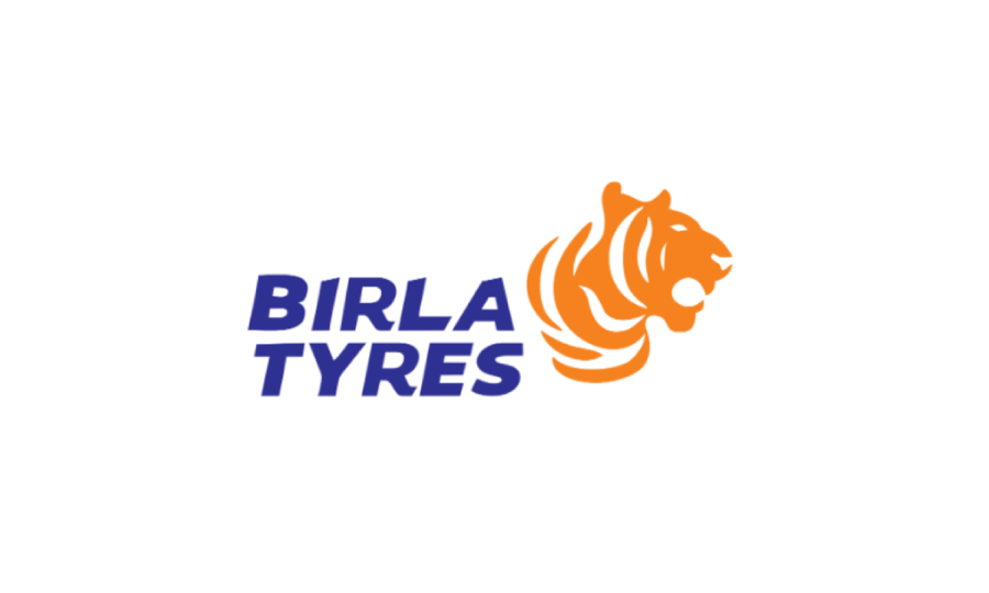
Birla Tyre has introduced a refreshed brand identity, unveiling a new logo and redesigned website as part of a strategic repositioning under new leadership. The rebrand aims to align the company with evolving trends in mobility and customer expectations across Indian and global markets.
The redesigned logo features a custom typeface that aims to convey speed and movement, paired with a tiger emblem, dubbed 'Tyger', which represents strength and agility. The choice of blue and orange in the logo palette is intended to reflect trust, optimism and drive.
According to the company, these changes symbolise a broader ambition to redefine Birla Tyre's market positioning as a high-performance, future-oriented tyre brand.
The rebranding includes a newly designed corporate website, intended to improve user experience and digital engagement. The updated platform will serve as a key hub for customer outreach and brand communication.
The company stated that the visual overhaul is part of a comprehensive marketing strategy, which will include campaigns across digital, print, TV and outdoor channels to build awareness and appeal to both traditional and modern audiences.
The brand refresh follows the acquisition of Birla Tyre by a consortium led by Himadri Speciality Chemical and Dalmia Refractories. Under this new ownership, the company has stated its commitment to progress, innovation and relevance in a fast-evolving automotive landscape.
Tagged with: Birla Tyre, brand relaunch, tyre branding, tyre marketing, Indian tyre market, new logo, tyre website, Himadri Speciality Chemical, Dalmia Refractories
Disclaimer: This content may include forward-looking statements. Views expressed are not verified or endorsed by Tyre News Media.